Today I'd like to discuss creating a body of photographic work from which to paint, in preparation for the upcoming workshop: PAINTING WITH PHOTOSHOP. I suggest beginning with florals and landscapes as they are easier subjects than people to portray.
Let's begin with photographing a simple but lovely floral setup. If you looked at my previous post you will have seen some gorgeous examples of florals gleaned from Pinterest. The board I've collected on FLORAL DESIGN has been providing me with a wealth of inspiration as well as information.
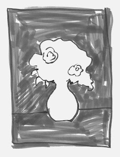
For example, I have found by examining my favorite images there, that I am most drawn to floral arrangements where the background AND foreground ARE OF THE SAME VALUE -not necessarily of the same color but of the same tonal value of light or dark. If the background and foreground are both light the floral display will shine. If they are both dark in value, the floral display will likewise take center stage. But if they are of different values they will usually (not always) compete with the florals that you are trying to showcase. (One exception to this rule is the image I actually chose to represent my last post on floral design. If you notice it has a light background and a darker foreground.)
However, in general, it's a good rule to stick with the same value for both background and foreground:
EXAMPLE OF SAME DARK VALUE FOR BACKGROUND AND FOREGROUND
EXAMPLE OF SAME LIGHT VALUE FOR BACKGROUND AND FOREGROUND
EXAMPLE OF VARYING VALUES FOR BACKGROUND AND FOREGROUND
(not recommended!)
Now that we've got that concept under our belt the next thing that I learned is that, while starting out, it's best to stick with a limited color scheme. I chose for my first floral arrangement a limited palette of pale violets and fuchsia flowers, and than added a touch of red and white as well.
Next, choose a flower that will stand out and become the FOCAL POINT of your whole painting. Focal Point is everything in art, music, literature, building construction, cooking, etc. We're going to learn all about that in the workshop. For now let's understand that focal point is the part of the painting that captures the viewer's eye the most. It is usually DIFFERENT from any other area of the painting, and has the brightest color or most amount of contrast. You as the artist, through the techniques you imploy, lead the viewer to that spot.
First, you must decide FOR YOURSELF what that focal point will be! In floral arranging it is usually a large flower that is fairly different from the rest.
With that in mind, I chose white, pink and violet carnations, a few small red roses for good measure and one gorgeous pale pink lily to be my focal point. Oh yes, and I threw in some sprigs of sage from my garden! (My flowers were all chosen at Publix, a supermarket in Florida, where you can buy cheap mini bouquets for $3 each. I bought 4 of these for a whopping total of $12.)
Now I was ready to set up my floral display. I have a blue wall in my studio which I decided to use as my background and used some blue foam core from Michaels as my base or foreground.
Here is the result:
IMAGE PREPARED FOR PAINTING
I used a 3.5 F-stop (rather than a 2.8 or lower F-stop) when shooting because I did NOT want to blur out some flowers while keeping others in focus. This time I wanted every flower to be in focus so I could make the decision as to what to blur while painting. I did what I would call a very light edit on this image-a touch of sharpening and contrast, plus a gentle lightening of the overall image. That's it! No color correction at all. All of the Photoshop actions for making theses corrections and more will be in my new PREP, PAINT AND PUNCH-UP ACTION SET included in the workshop.
Notice the LILY in the center. That's my focal point.
I still had some flowers left over so I created a second floral arrangement:
Limited editing here as well….
I even cheated and added some fake silk flowers! Can you tell which ones they are?
Then I took the same arrangement and put it up against the turquoise wall in my living room:
Again..very light editing, except that this time I decided to blur out the demarcation line where the counter meets the background, and some areas around the outside edges of the flowers in preparation for painting…
And that's it! Keep things simple-and cheap-when creating your first floral arrangements.
REMEMBER:
1. choose a background and foreground with the same VALUE
2. LIMITED color scheme when choosing your flowers
3. Select one big, beautiful flower as your FOCAL POINT!
And…HAVE FUN!


No comments:
Post a Comment